For the past year, my job was to get people to click on a show about writing.
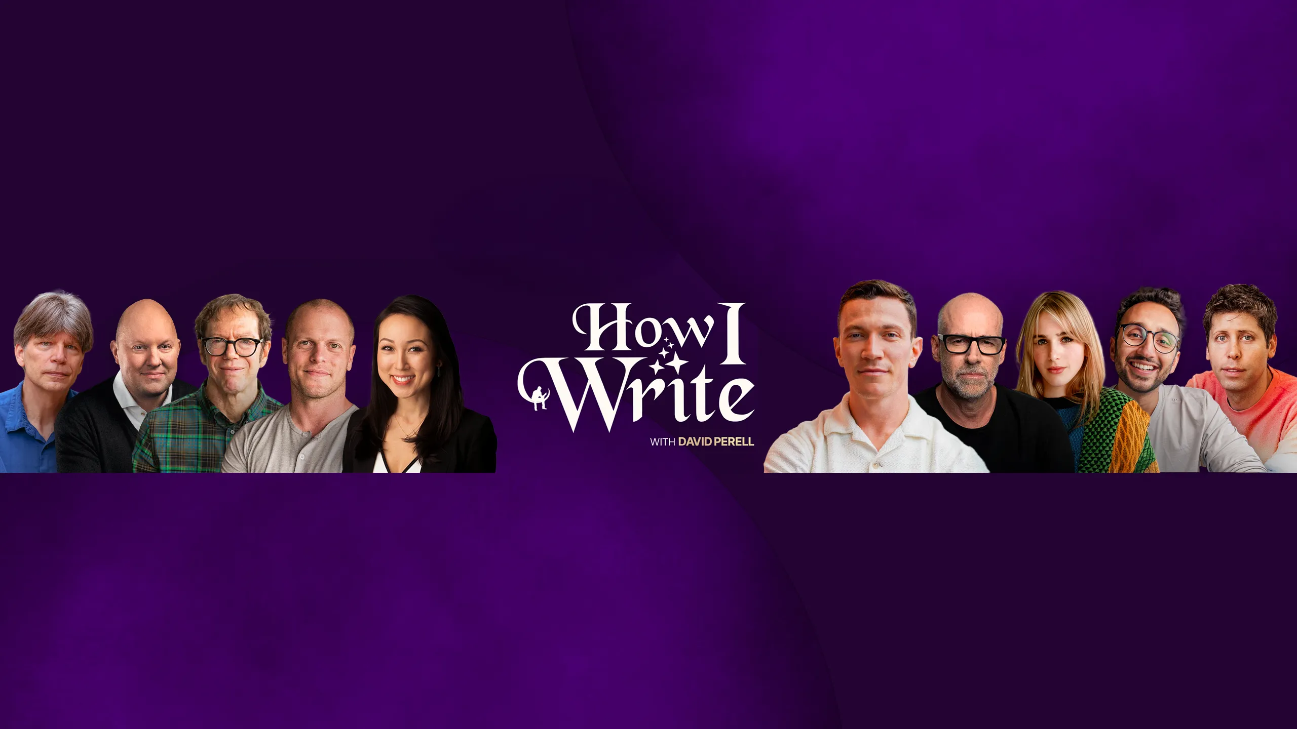
David Perell runs what might be the largest one on the internet. It’s a YouTube channel called How I Write where he sits down with authors and goes deep on craft.
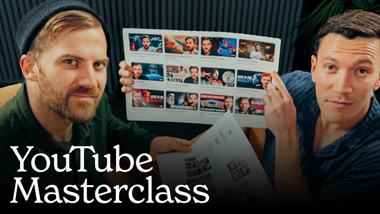
I joined the team in September 2024 to handle the packaging. Thumbnails, titles, positioning, how the channel looks and feels when someone lands on it. The How I Write channel had about 61,000 subscribers at the time. Across roughly 50 videos, the work accumulated over 5.2 million views and contributed to the channel crossing 200,000 subscribers. I also redesigned about 20 older thumbnails to bring the whole library into a consistent visual system.
What follows is everything we learned. The packaging principles that worked, how we tested them, what didn’t, and some key takeaways that should help you apply this to your own content.
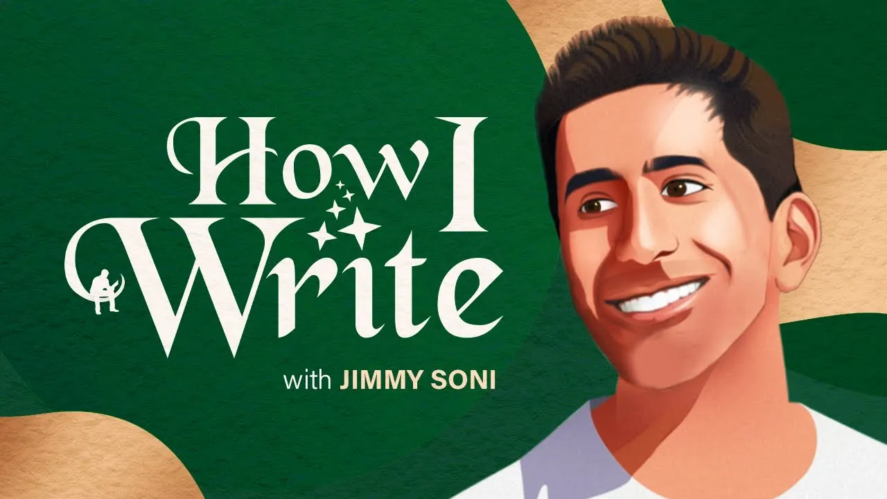
A Show About the Craft of Writing
David Perell has a following of over 470,000 people on Twitter, where he’s known as “the writing guy.” In August 2023 he launched How I Write, a show where he sits down with writers and goes behind the scenes on how they actually do their work.
He’s described it as “Chef’s Table for writers.” The conversations go deep on the art of writing, how people think, and what it actually looks like to spend decades mastering creative work. The guests include Pulitzer Prize winners, bestselling authors, poets, and journalists.
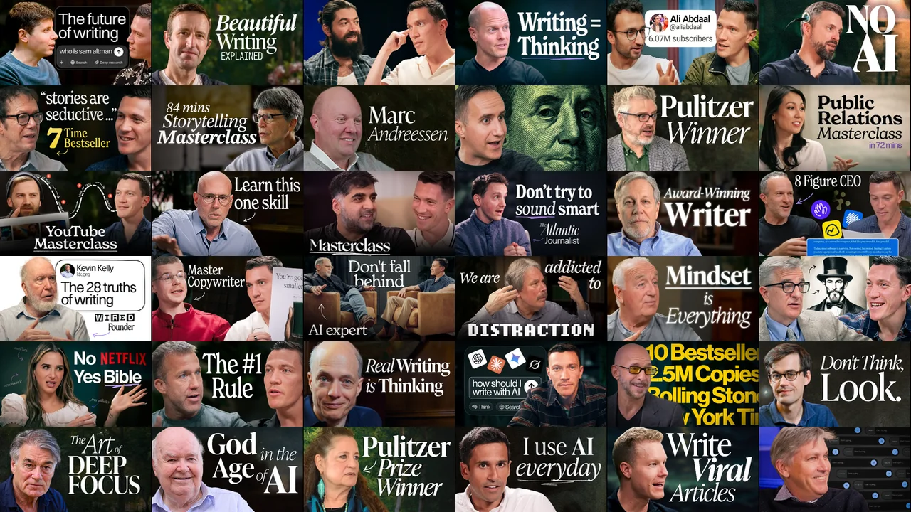
One of the things that makes the show stand out is the production quality. The sets are beautiful and intentionally designed. If you watch an episode you notice the lighting, the composition, how everything feels considered and purposeful.
The Sets
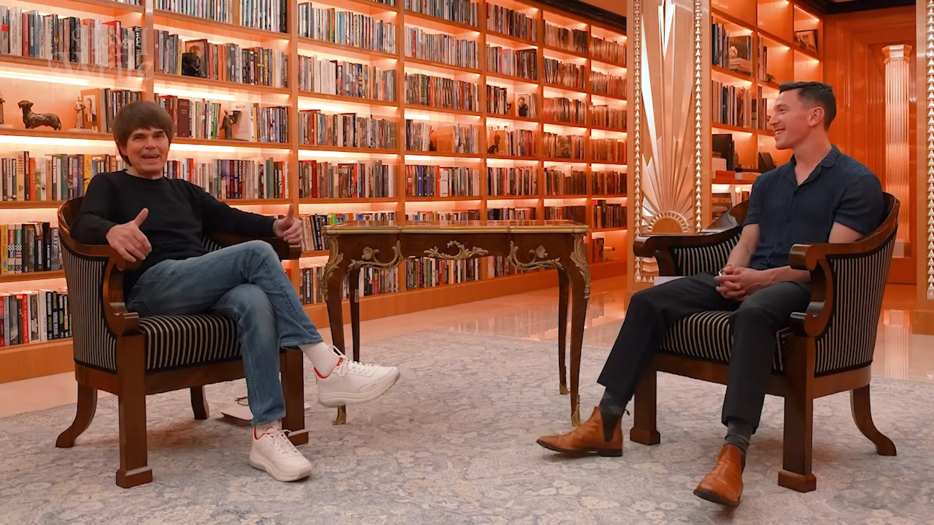
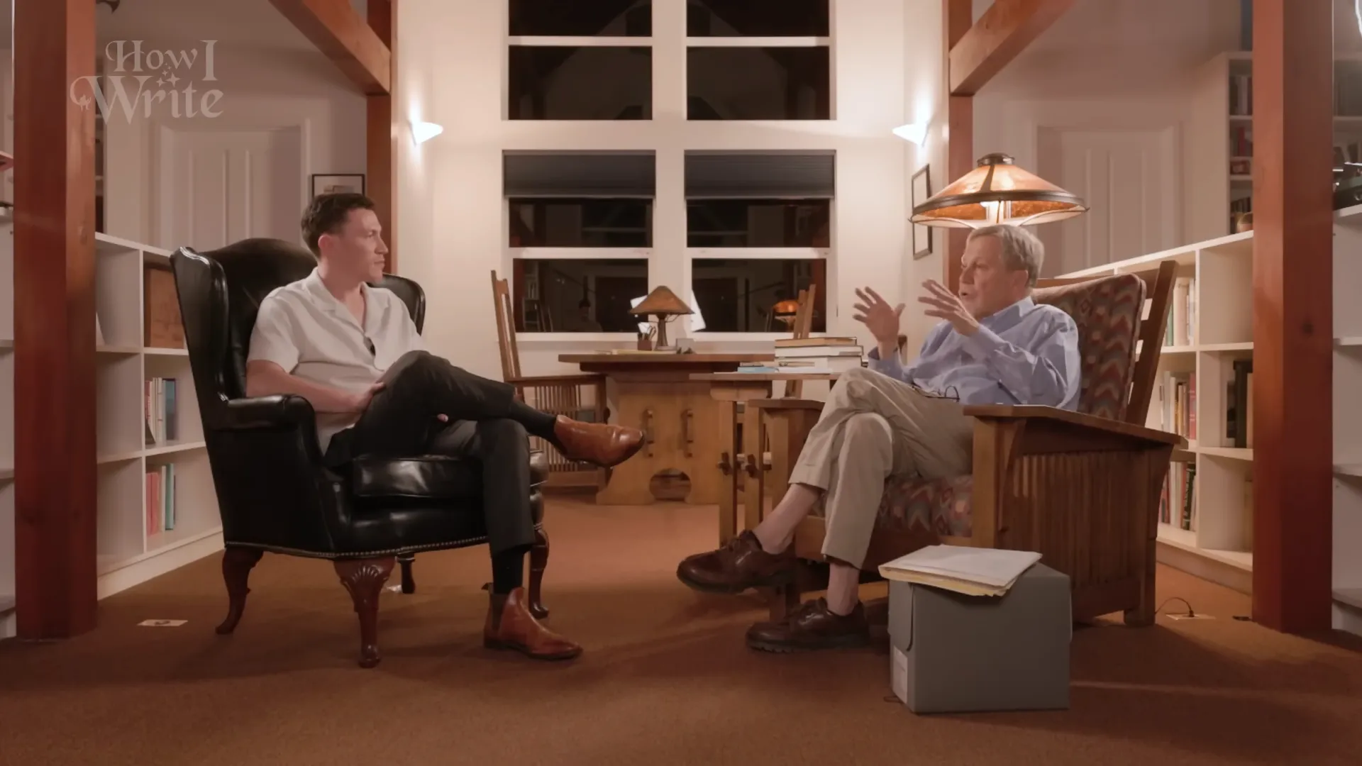
Every episode is filmed on a different, intentionally designed set, and the attention to set design became a core part of the show's identity.
The interviews go deep. Hour-plus conversations about writing, storytelling, and the creative life. The editing is sharp and the guests are people at the top of their craft.
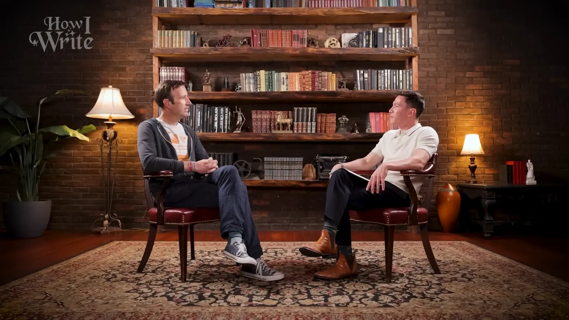
The channel had been running for about a year before I joined. The thumbnails had their own art direction, but they weren’t quite speaking YouTube’s language yet.
Original style
New style

Both styles had their own look, but the newer thumbnails made it easier to understand the format and recognize the show at a glance.
The packaging needed to match the content and work together with the set design, the guests, and the first thirty seconds of every video.
Packaging Is Strategy
When people hear “packaging” they often think it just means making a thumbnail and writing a title. You pick a nice image, put some text on it, and click publish.
It’s a lot more than that.
You might already know that packaging involves psychology. You’re trying to understand what makes someone stop scrolling and click. But it also involves design, branding, copywriting, and broader channel strategy. The thumbnail makes a promise. The title frames the promise. The first thirty seconds of the video have to deliver on it.
Most creators already treat their Instagram profile like a second homepage. For a channel or a business like David’s, the YouTube page is the real one. Someone lands on it and makes a split-second decision based on how everything looks together. The thumbnails sitting next to each other tell a story about what kind of content this is and who it’s for.
The channel needed someone to own this layer. The content was world-class. The editing, the guests, the sets were all top-notch. But if people don’t click, they don’t watch.
That meant creating 15 to 20 thumbnail variations per video, developing title frameworks, running extensive A/B tests, and thinking through how each video fit into the larger brand. Everything had to work within David’s brand and the How I Write brand he was building. We wanted growth, but not at the expense of what made the show distinctive.
The Principles
Counter-Positioning
Most YouTube thumbnails follow a certain formula. Bold colors, everything framed as urgent and time-sensitive. Every platform has its own language and you have to speak it to play the game.
But David’s content was slightly different. The conversations were slower, deeper. The guests tended to be older and wiser, people with lifetimes of experience. The topics are things like storytelling and the creative process, ideas that will matter just as much in ten years as they do today.
Without fully realizing it at first, we were counter-positioning against the noise. Most of YouTube feels like it’s screaming at you to learn something right now. David’s show is the opposite. People want to watch a Cambridge professor talking about what makes writing beautiful, or two poets having a three-hour conversation about language.
The packaging needed to reflect that. More serious expressions. Visual weight that matched the intellectual weight of the conversations. We embraced the contrast and made it part of the positioning.
Sometimes Obvious Is the Answer
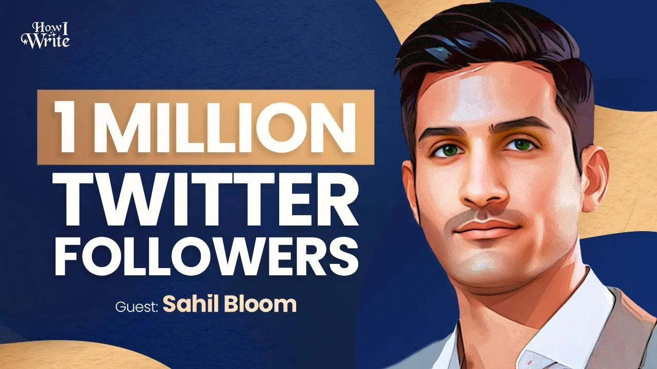
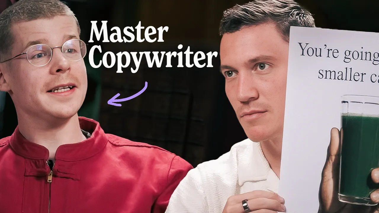
The first video I worked on was the Sam Altman episode. It was shorter than some of the other conversations, covering a lot of different ground, and we knew we’d be reaching well beyond the usual writing audience.
Sam Altman is the CEO of OpenAI and he hadn’t done too many interviews at that point. The conversation was about writing, but at the time writing and ChatGPT were very much in the zeitgeist. We knew people were going to click.
Our first instinct was to lead with credentials. “OpenAI Founder,” “ChatGPT Creator.” Those performed well out of the gate. But we kept A/B testing, and over time a different concept won out.
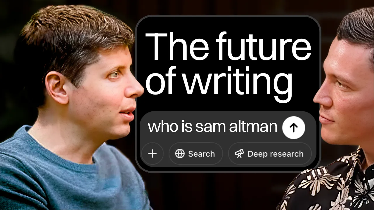
Thumbnail
Title
The Future of Writing Is Not What You Think — Sam Altman
The winning version frames it as “The Future of Writing Is Not What You Think” with both David and Sam in a face-off composition. The two-person layout matters because it immediately signals this is an interview, not a commentary video. With most other guests we don’t include David’s face in the thumbnail, but with someone as recognizable as Sam Altman, you need that visual cue. Otherwise it just looks like David is reacting to him, or it’s a typical explainer video.
And the “future of writing” angle works because it subverts what you’d expect. You see Sam Altman and you think AI. Framing the conversation around writing pulls you into something you didn’t know you were curious about.
The second video I worked on was the Richard Powers episode. I’d only been on the team for a couple of weeks at that point. I hadn’t been part of the previous decisions about how thumbnails were made, which approaches had been tried, or why certain ideas had been abandoned. I was looking at everything with fresh eyes.
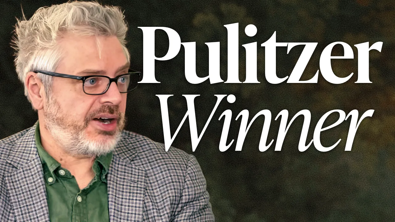
So when I saw that this guest was a Pulitzer Prize-winning novelist who teaches at Stanford, my first thought was pretty simple: why don’t we just put that in the title?
Thumbnail
Title
Meet Pulitzer Prize-Winning Stanford Professor – Richard Powers
When you’re deep inside a project, you can overthink things. You dismiss the simple answer for reasons you’ve half-forgotten. A second set of eyes cuts through that. Sometimes the most obvious packaging is the one you have to test. It’s a disservice not to.
That video became a 10.7x outlier with over 780,000 views. It’s still the most-watched podcast episode on the channel.
Don’t assume viewers will recognize names. Put the credibility front and center, whether that’s Pulitzer Prize winner, Stanford professor, or Cambridge professor.
This pattern held consistently. The Cambridge Professor video got 241K views. The Harvard Professor video got 694K. The Oxford Professor video on AI got 232K.
Viewers responded to people who have clearly lived and thought deeply about these topics. If your conversation has weight, your packaging should have weight.
The Credibility Pattern
How to Write Freakishly Well — Paul Harding
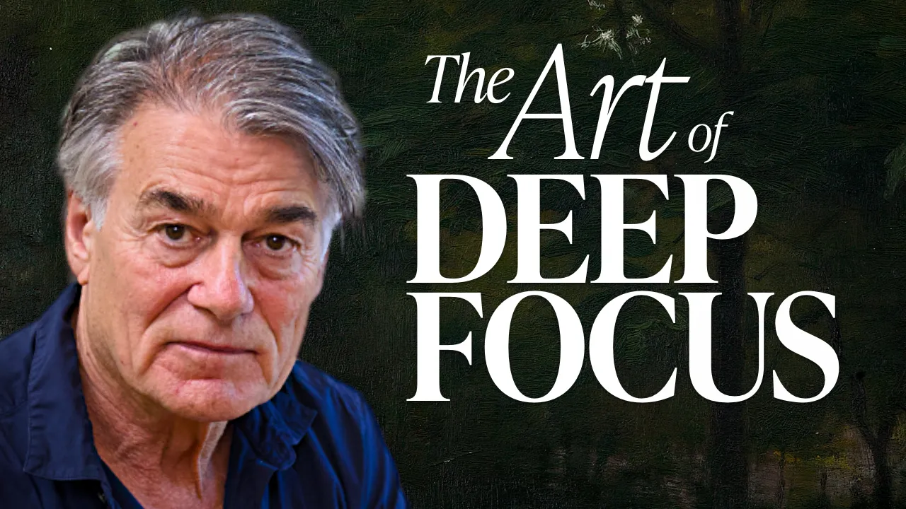
Cambridge Professor: Why All Writing Sounds the Same Now (Robert Macfarlane)
Harvard Professor Explains The Rules of Writing — Steven Pinker
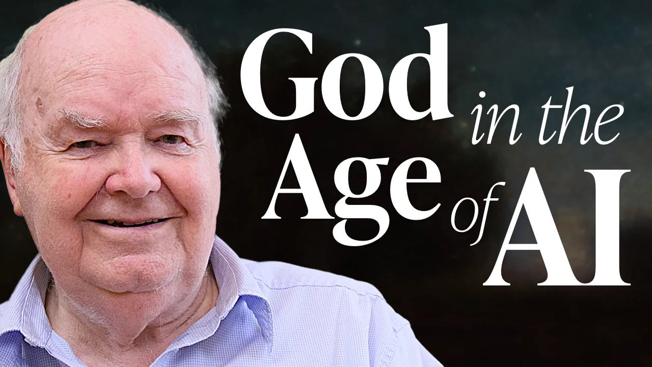
Oxford Professor: AI Is Humanity's Attempt to Make God — John Lennox
When your guests have this kind of background, make sure the packaging shows it.
Match the Weight
As you saw above, David went out of his way to curate sets that are beautiful and highly produced. One of my roles was figuring out how to make that visible in the thumbnails. When you watch the videos you can see how much care went into the production, and I really wanted to bring that out in the packaging.
The original thumbnails used illustrated art (which looked great) but made it hard to tell what the video was actually about. They didn't quite speak YouTube's language. The newer ones use real photos from the actual sets, so not only is the production quality visible before you click, but you understand the format and can tell what the video is going to be about.
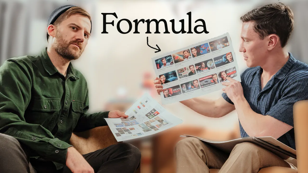
We developed a visual formula over time, and it went far beyond just picking a font and a color.
Visual consistency means consistent everything. Not just fonts and colors. Color correction, framing, face size, font placement, the number of words on a thumbnail, where they sit, how big the text is, what’s italic and what’s not. All of it.
Titles work the same way. Most people think about how a title reads in their head, but not how it looks. Does it look good to click? Does the length feel right sitting under the thumbnail? How the guest name appears. We’d use parentheses sometimes, but never stray too far from the system.
On YouTube now, people hover over thumbnails and see the video start playing. So the thumbnail and the first few seconds need to feel like the same thing. When someone hovers over a How I Write thumbnail and sees the actual interview with the beautiful set, it confirms what the packaging promised. That transition has to feel seamless.
We didn’t follow every rule every time. We probably should have been more disciplined about it. But because we did it consistently enough, the effect added up. At some point the viewer starts to impulse-click because they recognize the visual pattern before they even read the title.
Building a Consistent Visual System
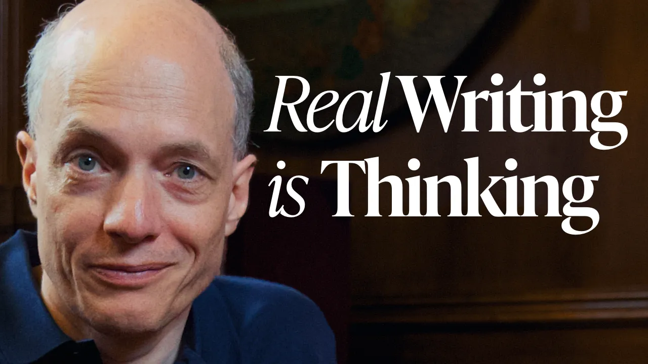
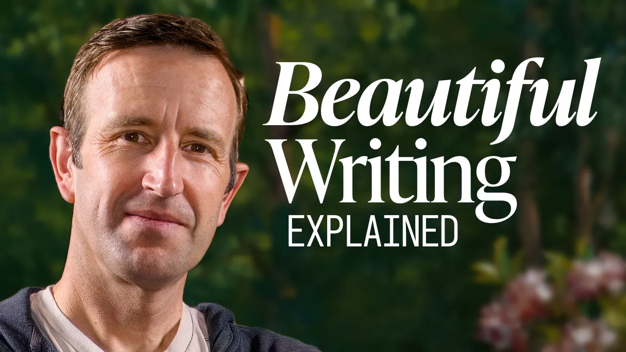
How to Write Something Truly Beautiful — Alain de Botton
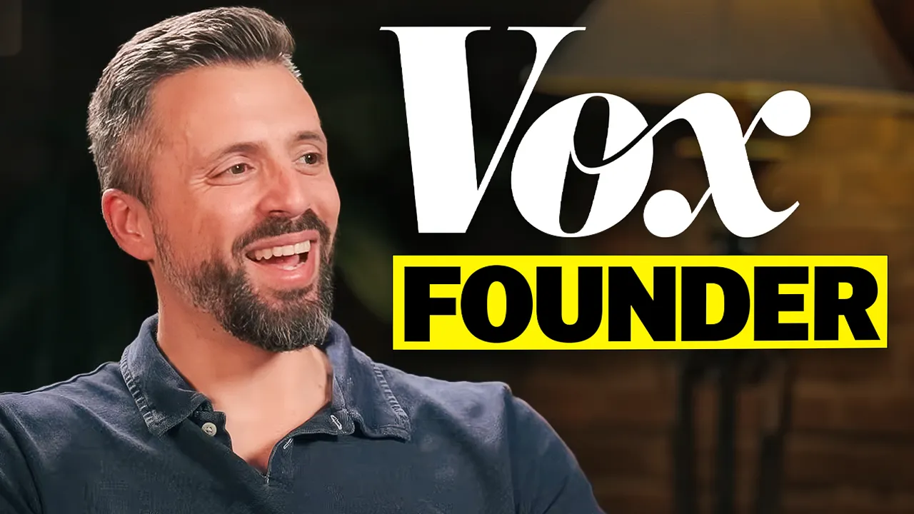
Johnny Harris Reveals How He Writes YouTube Videos
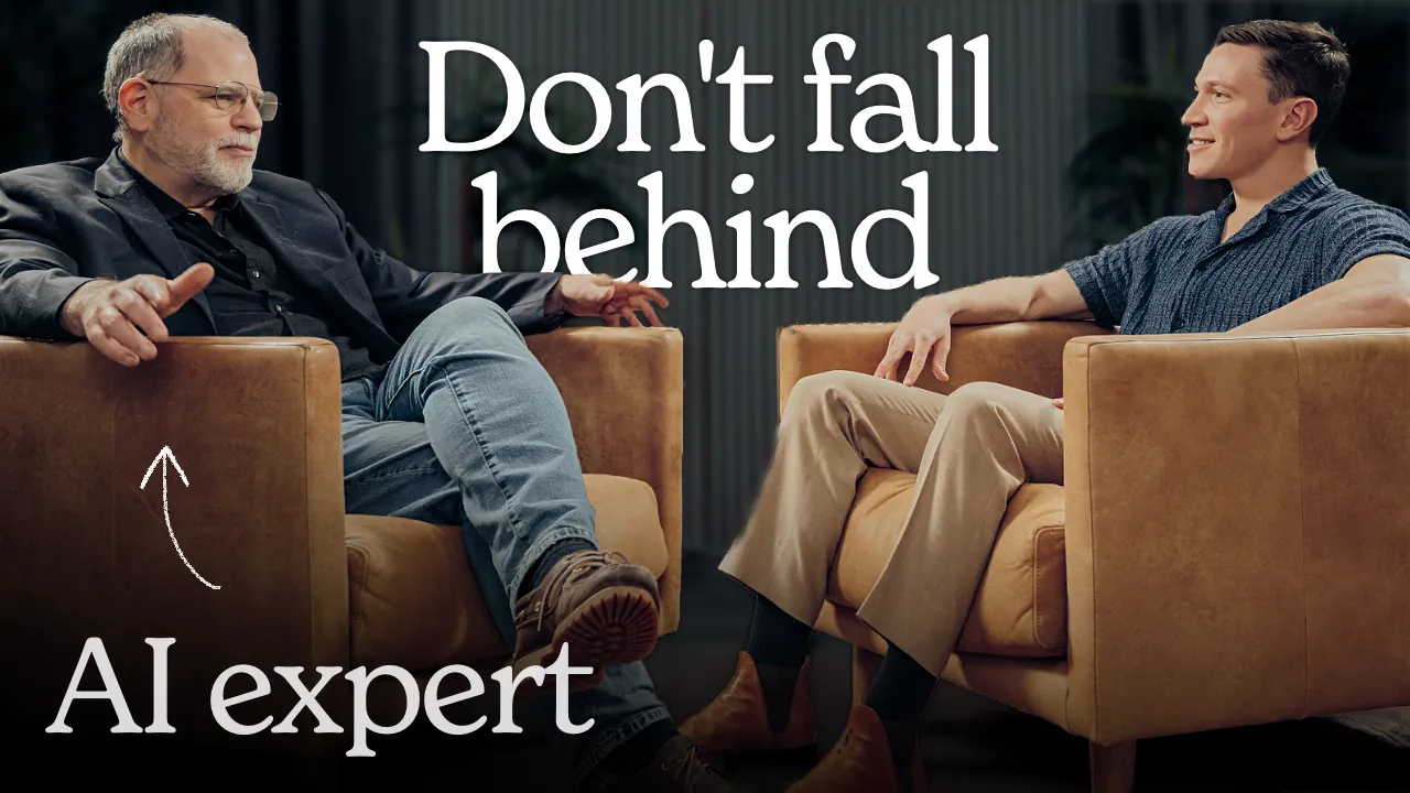
The Case Against Writing with AI — Ezra Klein
Inside the Mind of a Master Writer — David Whyte
The Future of Writing Is Not What You Think — Sam Altman
How to Write with AI — Tyler Cowen
Learn Copywriting in 76 Minutes – Harry Dry
Meet Pulitzer Prize-Winning Stanford Professor – Richard Powers
Cambridge Professor: Why All Writing Sounds the Same Now (Robert Macfarlane)
Harvard Professor Explains The Rules of Writing — Steven Pinker
How to Write Freakishly Well — Paul Harding
Oxford Professor: AI Is Humanity's Attempt to Make God — John Lennox
When you scroll past a How I Write thumbnail now, you recognize it. And when you see the Cambridge Professor video with Robert Macfarlane’s face, that thoughtful expression, it feels substantial. You sense that this is going to be a real conversation, not a quick hit of information.
Writing Is Thinking
Writing advice doesn’t have a lot of search demand on YouTube. It’s not like tech or finance where there’s a built-in audience actively looking for content.
But framing writing as really just thinking made visible definitely hit more people. Everyone wants to think more clearly. Writing spans so many different industries and jobs and topics that you can always find a broader frame.
Instead of positioning videos purely as “learn about writing,” we often framed them around thinking and clarity. The viewer gets to learn how a genius thinks or hear a Harvard professor explain principles that will make them sharper. Writing just happens to be how they get there.
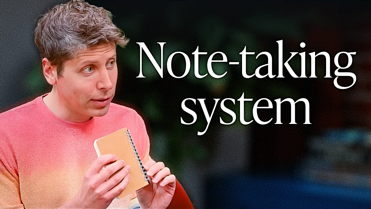
The best example of this was a clip from the Sam Altman interview.
Thumbnail
Title
Sam Altman's Method for Clear Thinking
This clip got 1.3 million views. It lifted the rest of the catalog with it.
The thumbnail is simple: an action shot of Sam holding a notebook with “Note-taking system” on the screen. There’s an inherent curiosity gap even without any text. He’s holding something, and you want to know what’s behind it.
Paired with the title “Sam Altman’s Method for Clear Thinking,” it taps into something aspirational. People want to think clearly. They want to see how the most successful people organize their minds.
This is a tried-and-tested topic (productivity systems, note-taking methods) and we had been picking up signals that the idea of writing as thinking was resonating with the audience. Comment sections, Twitter, how other videos were performing. The data was there.
I think the thumbnail still could have been much better (we couldn’t get that great of an image), but it does the job. We didn’t even need that many A/B tests. We tested it, confirmed it worked, and let it run.
Doing standalone clips like this was an exception for us. This was Sam Altman, the clip was strong, and we knew it would get the views. And when you do it sparingly, it actually lifts the whole catalog because people discover the channel through one big video and then start watching everything else.
Test Everything
What works for one channel doesn’t necessarily work for another, and assumptions are often wrong.
Every video got extensive testing. 15 to 20 different thumbnail variations, multiple title options, and sometimes seven or eight A/B tests per video. Some tests ran hourly. We used YouTube Studio’s native testing plus third-party tools.
Over time we figured out which combinations of click-through rate, watch time, and impressions tended to mean a video would perform well. Those became the benchmarks for knowing whether the positioning was working. But the numbers weren’t the whole story. Some videos with lower click-through ended up becoming massive outliers, and others with higher click-through sometimes struggled to find their audience.
We also developed frameworks over time. “How to” titles performed well. So did “Masterclass” framing and leading with credibility, like I mentioned. But we only knew this from testing, not from assumption.
Having a swipe file, studying outliers, and keeping an eye on how the platform is evolving are all important. You should always be looking at what’s working for other channels.
But sometimes the temptation is to take it a step further and just copy it. You see a thumbnail style that’s getting views and you try to replicate it.
The problem is that copying without context destroys brand coherence. If you keep chasing whatever the latest outlier is, people stop knowing what you actually stand for. All our testing happened within constraints, and every variation stayed within the visual system.
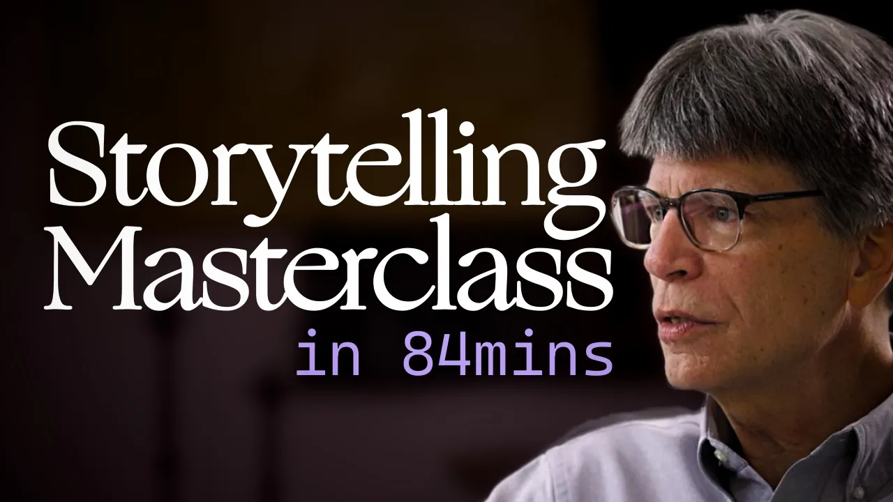
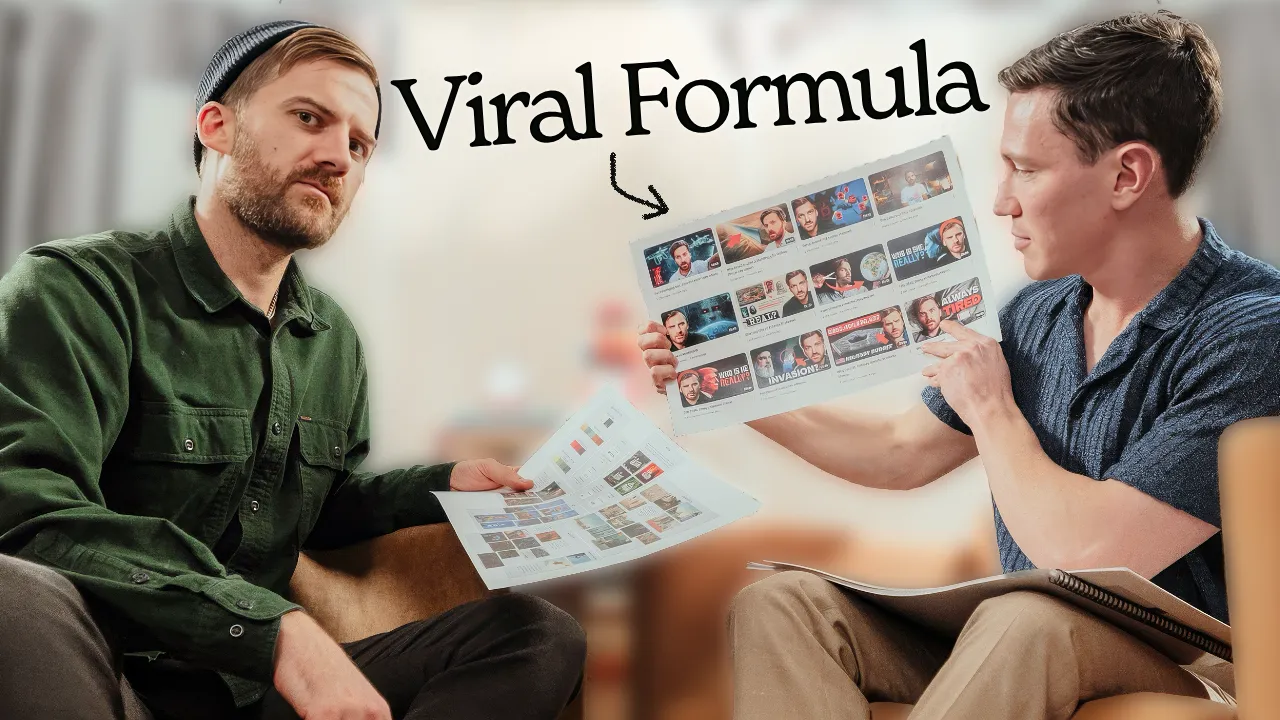
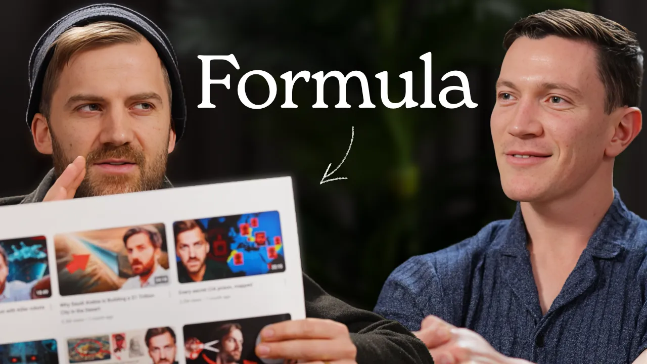
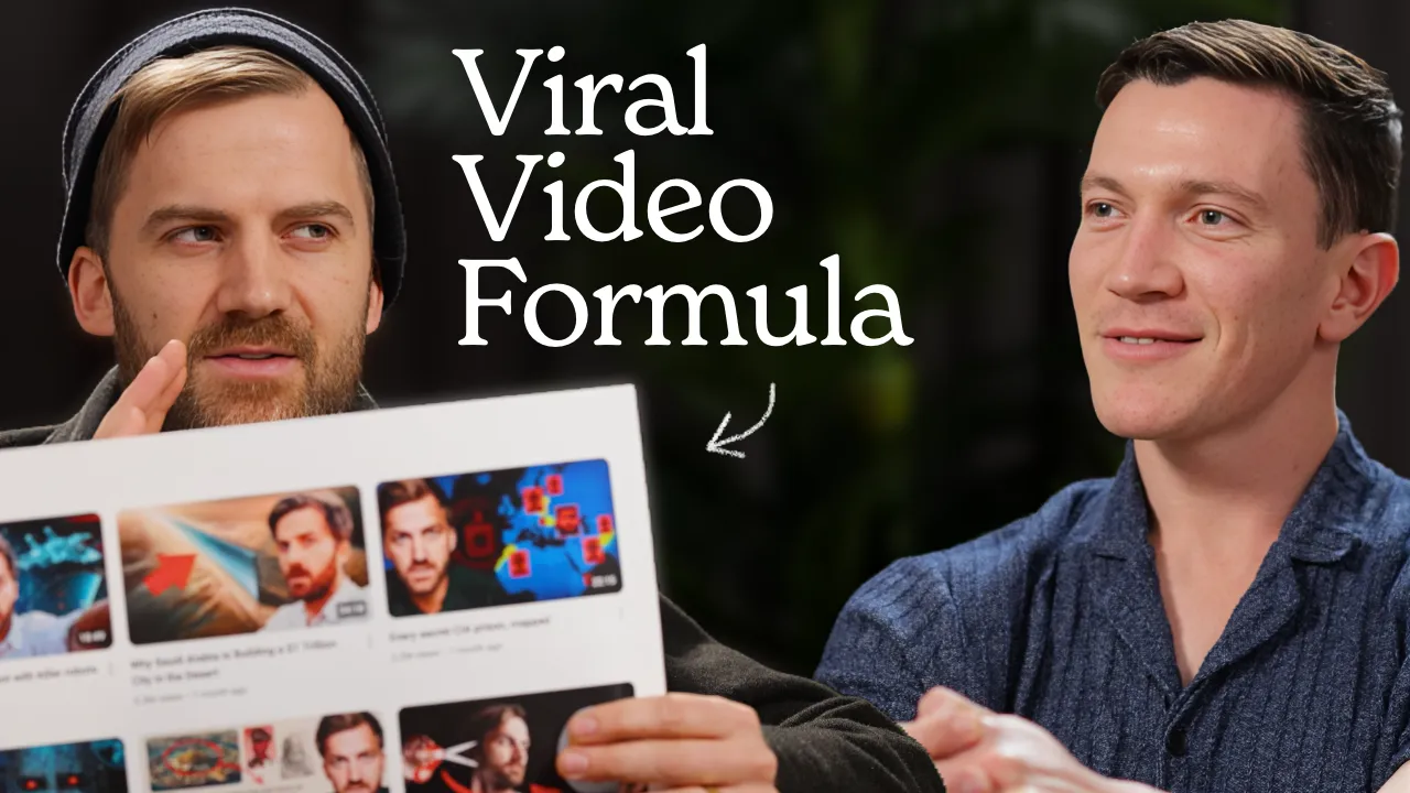
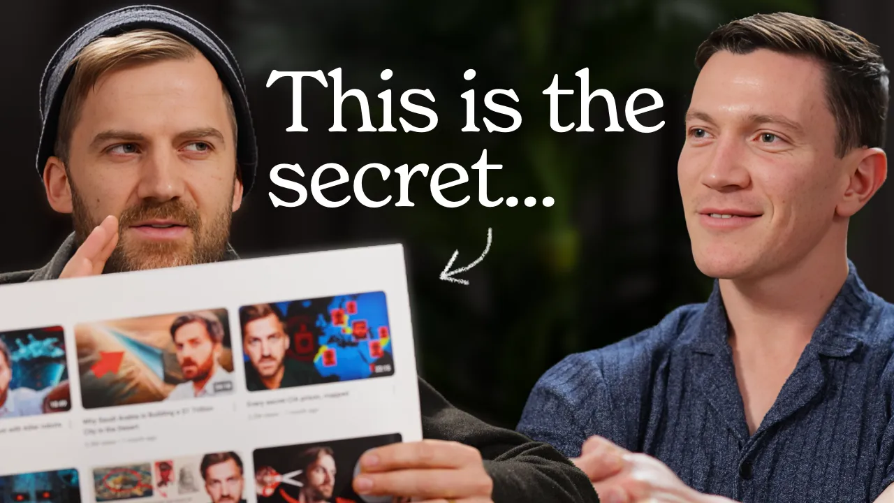
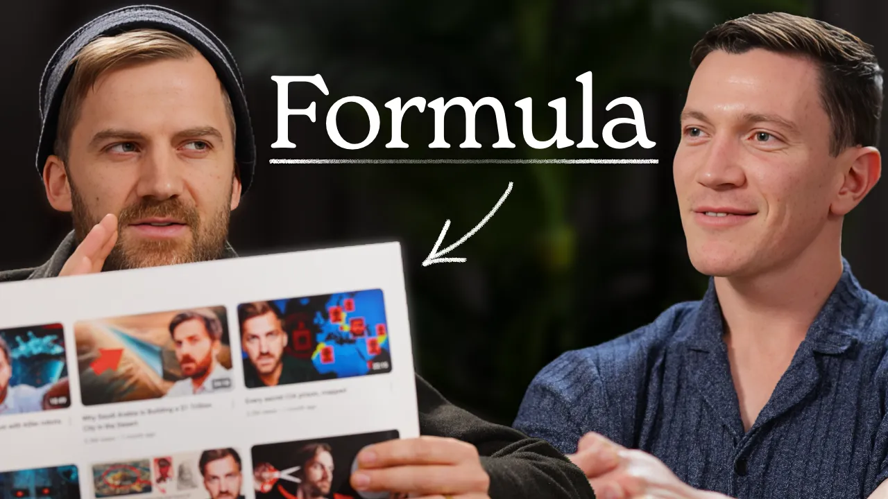
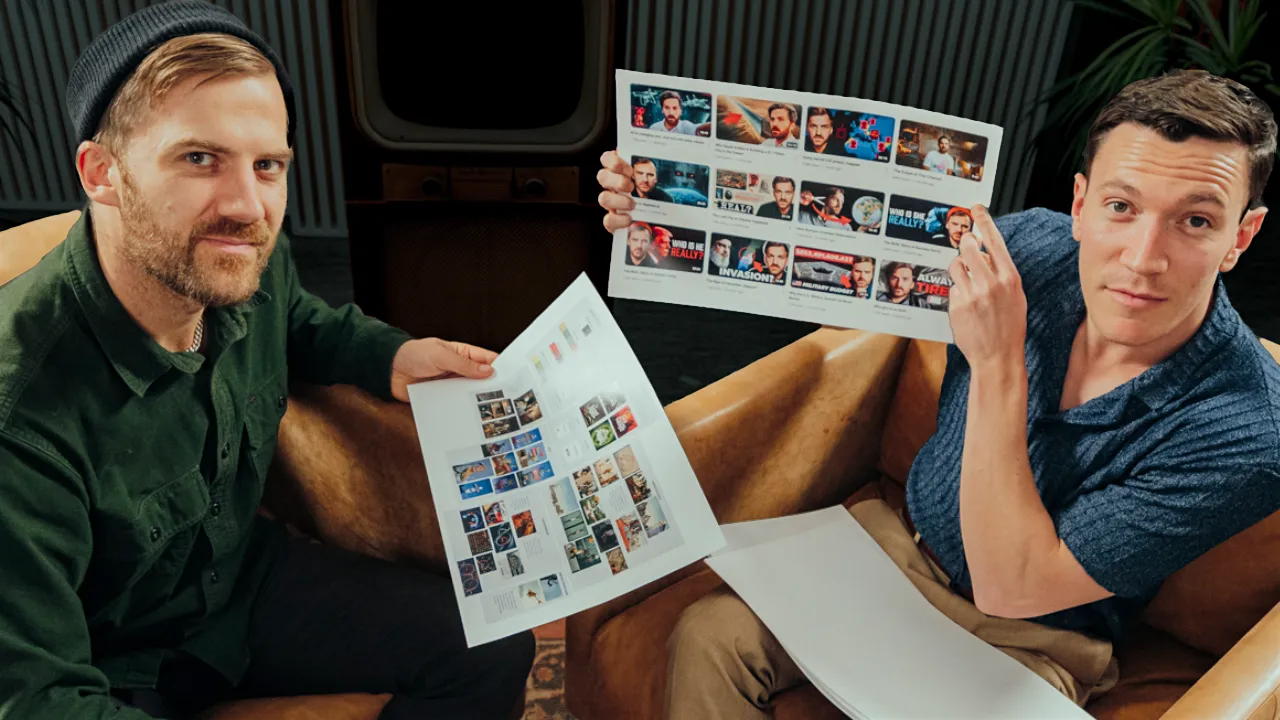
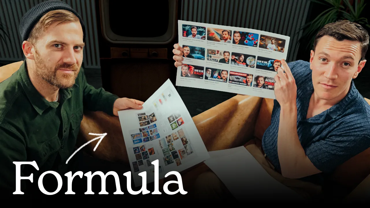
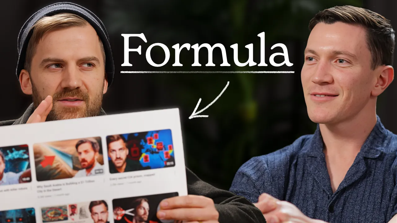
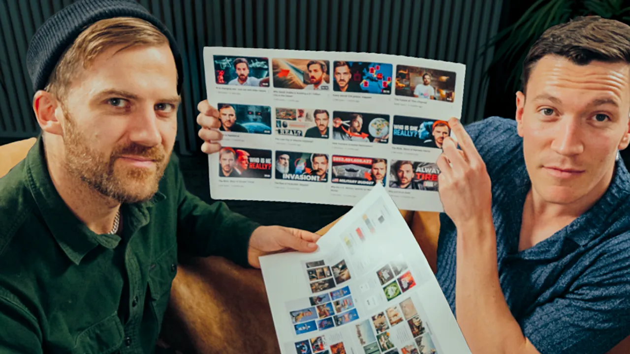
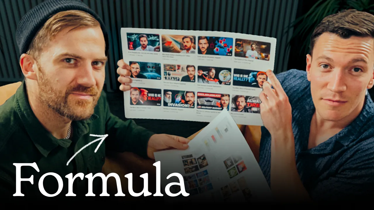
To give you an idea of what this actually looks like in practice, here’s every thumbnail and title variation we went through for the Johnny Harris episode. Six A/B tests, 28 thumbnail variations, and dozens of title options before landing on a final package.
Tests 1 & 2: Thumbnails

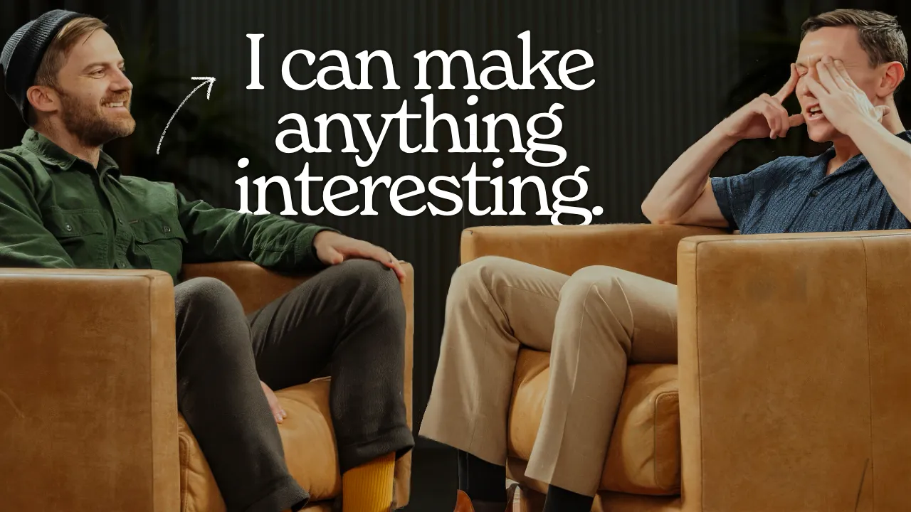
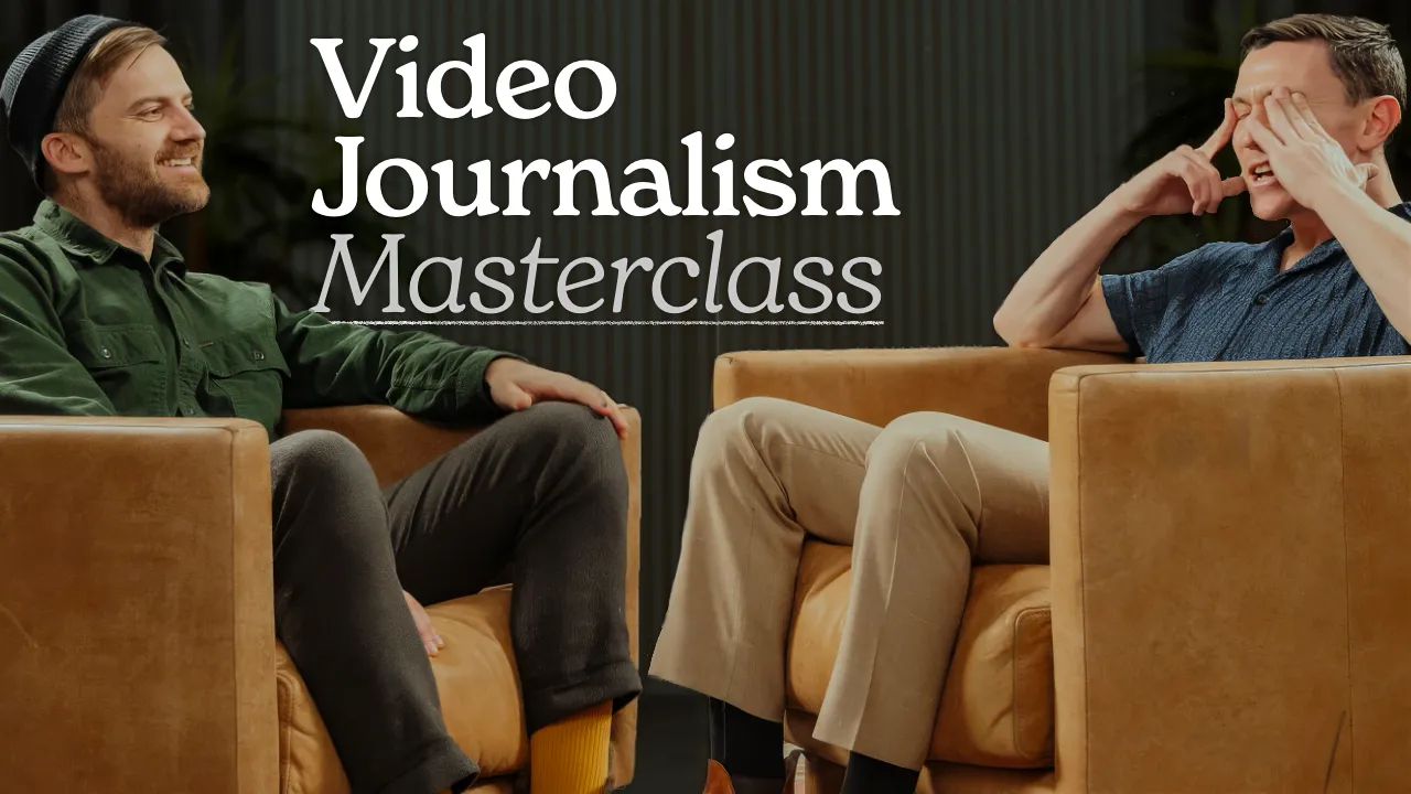


Ten variations across two base images: the couch interview and a closeup with Johnny holding his analytics. "Meet the King of YouTube Explainer Videos" was the early title leader. "YouTube Masterclass" in the thumbnail outperformed the other text options. "Formula" from the above-shot angle didn't hold up in test 2.
Tests 1 & 2: Titles
- How To Write A Killer YouTube Video
- The Secret to Going Viral on YouTube
- Master the Art of YouTube
- The Art of Writing for YouTube
- Meet YouTube's Favorite Journalist
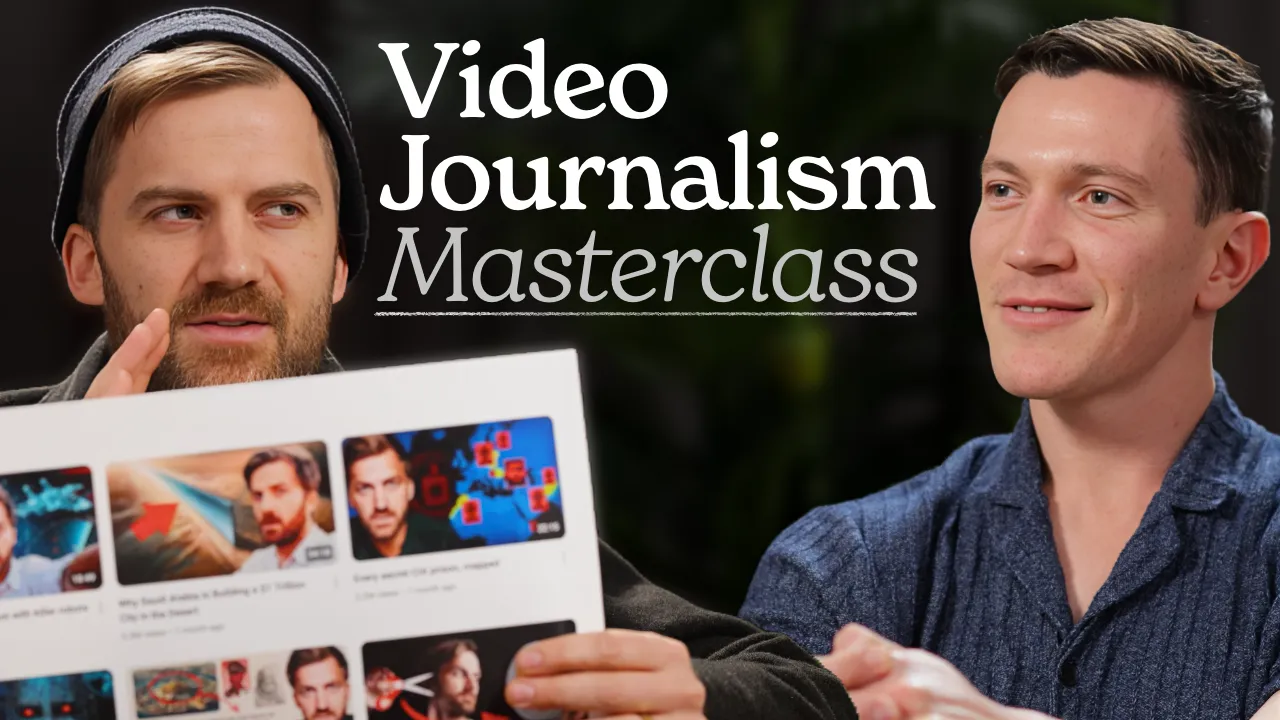
- Learn Video Journalism in 84 minutes
- Video Journalism Masterclass in 84 minutes
- This is what it really takes to make it on YouTube
- How This YouTuber Makes Every Video Go Viral
- How Johnny Harris Goes Viral Every Single Time
- Everything You Need To Know About Writing For YouTube
- The Writing System That Makes Johnny Harris Go Viral
Test 3: Thumbnails
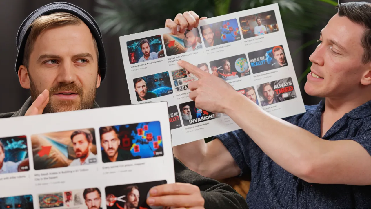
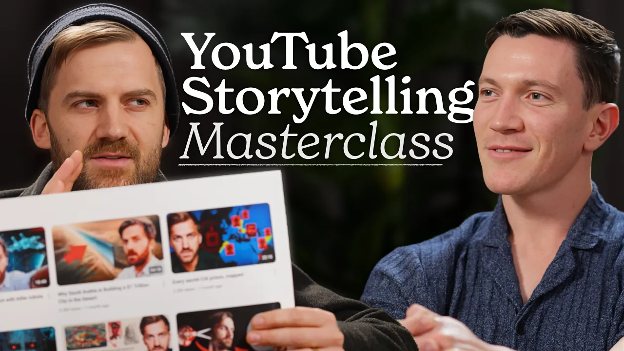
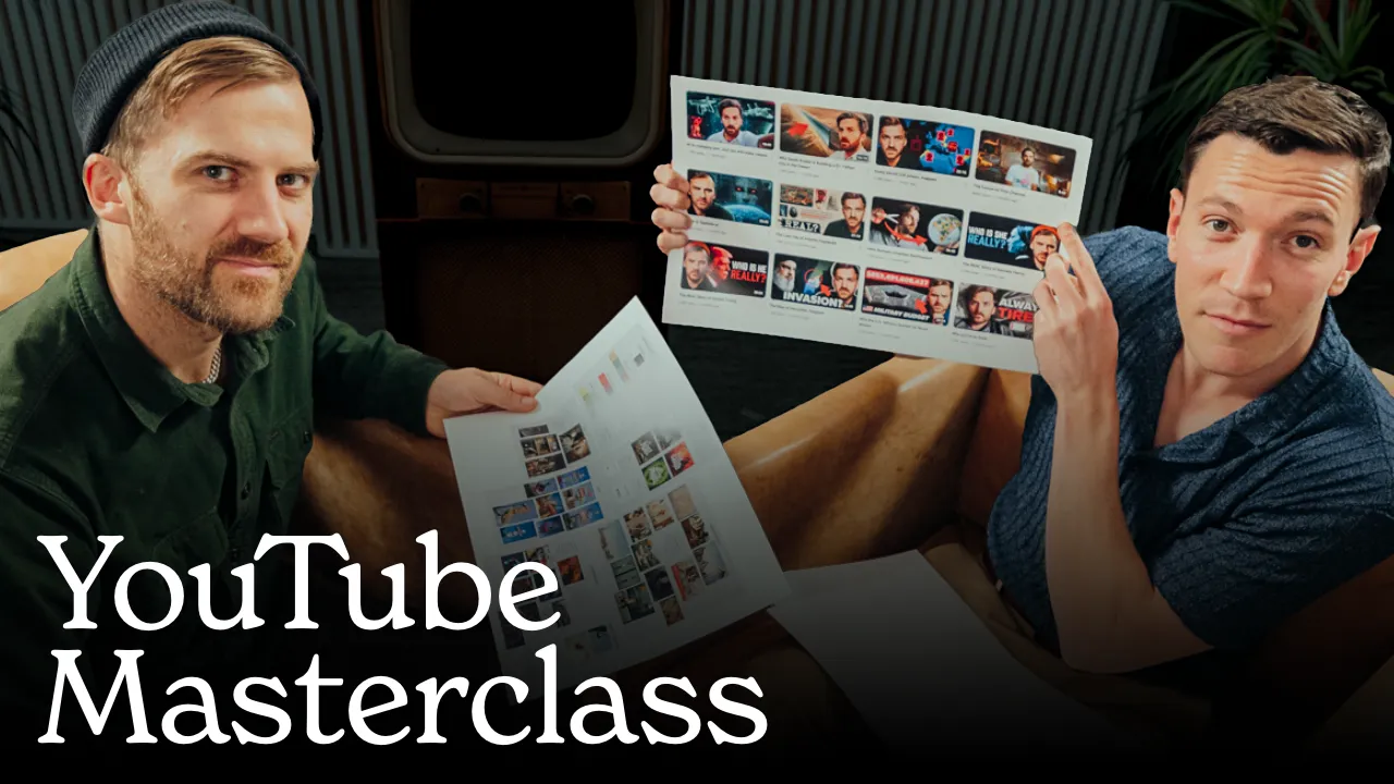
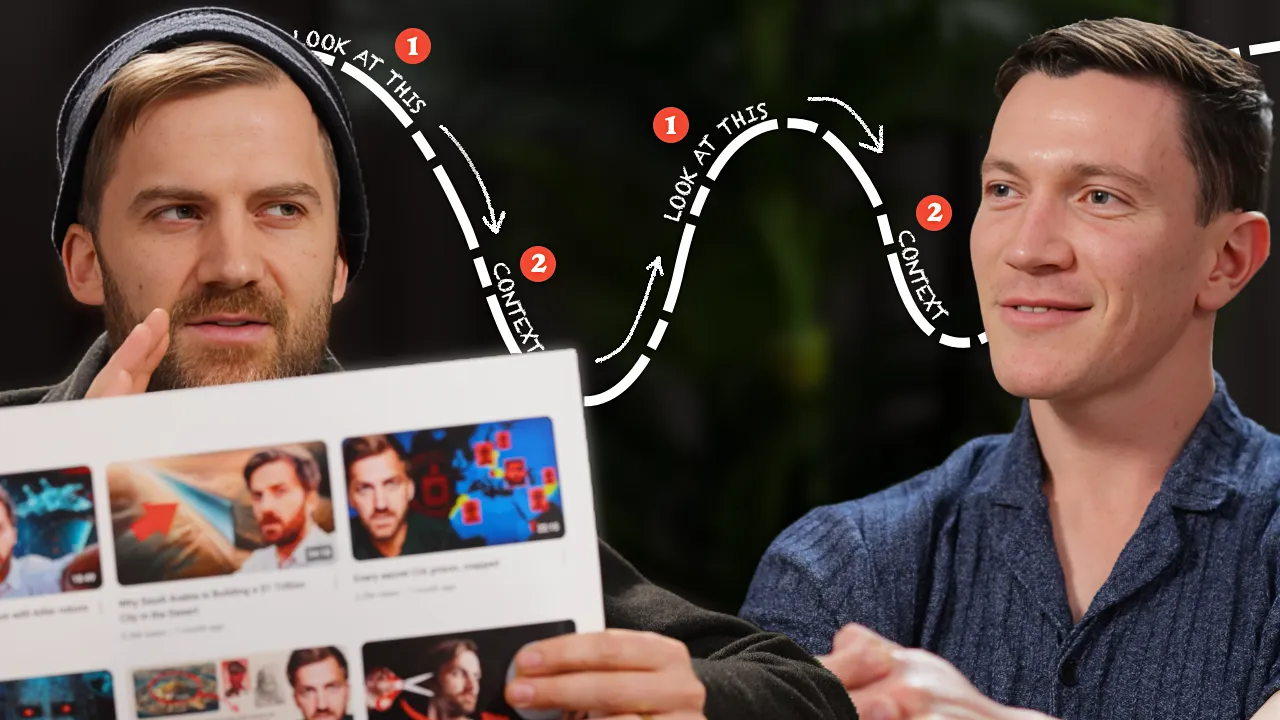
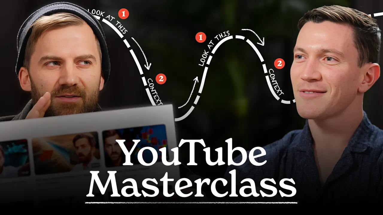

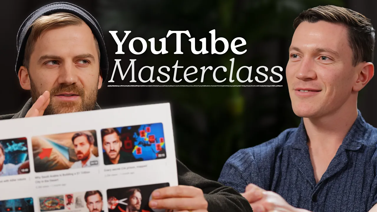
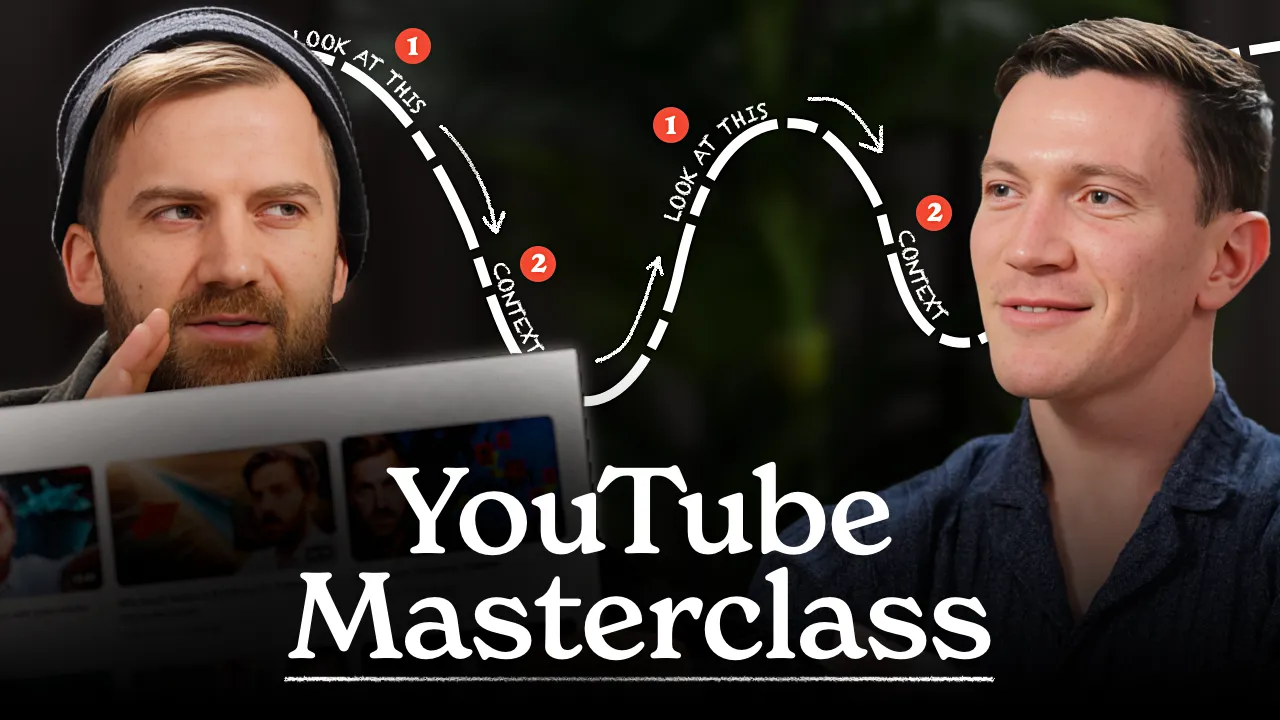
The big combo test. We ran every thumbnail against every title simultaneously. 18 thumbnails × 4 titles. Carried the top performers from tests 1 and 2, added "YouTube Storytelling Masterclass," the overhead couch angle, the roadmap diagram, and two new wide couch angles. "YouTube Masterclass" with the diagram started pulling ahead.
Test 3: Titles
- Johnny Harris Reveals His YouTube Playbook
- Learn YouTube Storytelling in 86 Minutes
- Meet the King of YouTube Explainer Videos
- How To Write A Killer YouTube Video
Tests 4, 5 & 6: Title Testing
With the thumbnail decided ("YouTube Masterclass" with the roadmap diagram), we ran three more tests focused purely on the title. Each test ran for four full days.
- Johnny Harris Reveals His YouTube Playbook
- Learn YouTube Storytelling in 86 Minutes
- Meet the King of YouTube Explainer Videos
- How To Write A Killer YouTube Video
"How To Write A Killer YouTube Video" overtook "Meet the King of YouTube Explainer Videos" in test 4, held through test 5, and we ran test 6 one final time to confirm.
Winner
Johnny Harris Reveals How He Writes YouTube Videos
28 thumbnail variations, 30+ title options, six A/B tests. "YouTube Masterclass" with the roadmap diagram won the thumbnail. The final live title ended up being one we hadn't even tested in the early rounds.
What Didn’t Work?
We tried a lot of things over twelve months. Not all of them clicked.
For a while, we leaned into Hollywood and screenwriting, thinking a broader entertainment angle would pull in more viewers. Some of those videos did fine, some found their audience over time. But the audience for writing advice on YouTube and the audience interested in screenplay structure turned out to be different groups. The total addressable market was just smaller than we thought for that angle. I could be wrong about this though. With different packaging or positioning, those videos might have found a bigger audience. It’s not that the content wouldn’t do well, it’s that we didn’t crack the packaging for it. Part of the ongoing work was figuring out which kinds of guests resonated and adjusting accordingly.
We also had stretches where we positioned videos for short-term clicks, trying to ride a trending topic or a timely guest. Those sometimes got an initial bump but stalled out. The algorithm takes time to find the right viewers, especially for a channel where the guest roster changes every week. Because writing spans so many industries, the guests were naturally all over the place. One week an AI expert, the next a Pulitzer winner, then a poet, then Alex Hormozi talking about copywriting, then a conversation about the Bible.
The AI angle was interesting. Some guests were pro-AI, some were somewhere in the middle, and some wanted nothing to do with it. The debates in the comment sections were genuinely compelling. Leaning into that tension early on helped get clicks without diluting the brand.
Evergreen positioning consistently beat trendy positioning because it gave the algorithm time to find the right people.
Here’s something I think a lot of people get wrong about packaging: it’s important, but it’s not everything. It’s one component. The guests you bring on, how the video is edited, how the first thirty seconds land, the brand you’re building. These are all part of the strategy. Packaging has to work within those constraints, and those constraints have to work within the packaging. When everything pulls in the same direction, the video performs. When one piece is off, it’s hard to tell which one caused it.
The Takeaways
The channel has since passed 220,000 subscribers, and the visual system we built is still running.
What I’d take away:
-
Lead with credibility. If your guest won a Pulitzer, put “Pulitzer winner” in the title. Everyone overthinks this. Test the obvious approach first.
-
Counter-position. The rest of YouTube is fast and optimized for dopamine. David’s show is deliberate and built for people who want to think. Leaning into that contrast is what made the packaging work.
-
Visual weight matters as much as the words. If your conversations are substantial, your thumbnails need to feel substantial too. People decide to click based on how something looks before they even process the title.
-
Small details add up. No single detail like the color correction, framing, face size, font placement, title length, or typography makes or breaks a video’s packaging. But applied consistently across fifty thumbnails, these details become a brand. Viewers start recognizing and impulse-clicking before they know why.
-
Package for the long term. Videos positioned around timeless topics kept growing for months. The ones chasing trends stalled. Give the algorithm time to find the right people.
Watch the Show
Working on How I Write taught me more about packaging and positioning than anything else I’ve done. I got to contribute to a show I admire, and I’m glad the work held up.
Check out David’s channel below. Even if writing isn’t your thing, there are definitely episodes that will be useful for you and change how you think about it.